Pantone Unleashes Their Spring Fashion Colors 2011

 Fashion Trends, Jewelry Trends  Comments Off on Pantone Unleashes Their Spring Fashion Colors 2011
Mar 092011


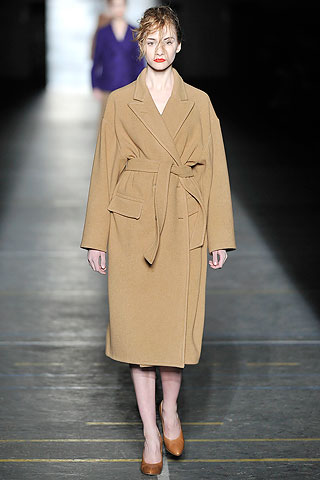
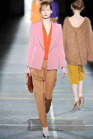
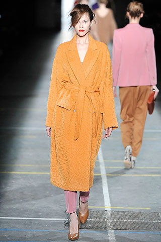
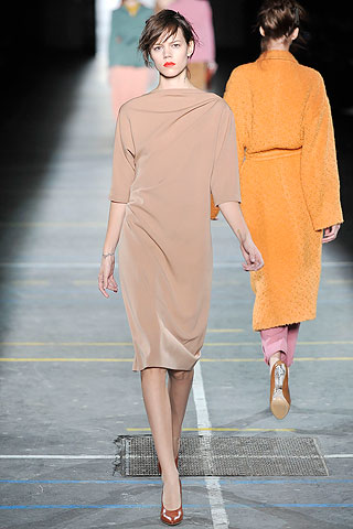
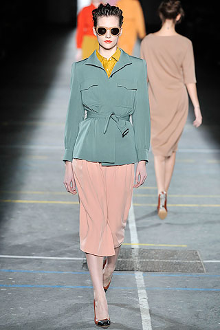
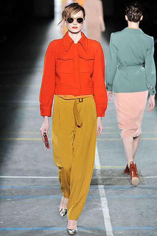
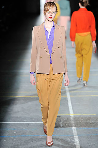
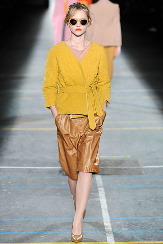
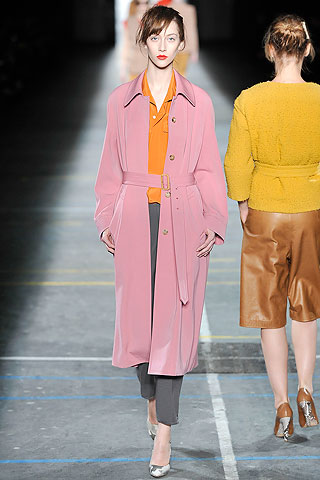
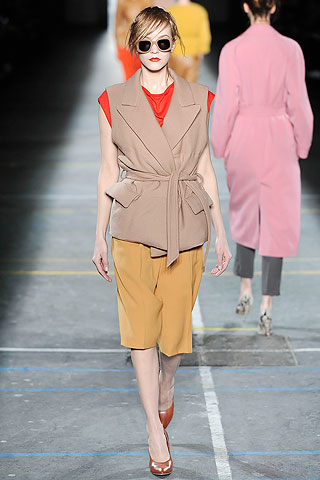
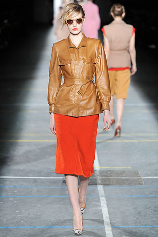
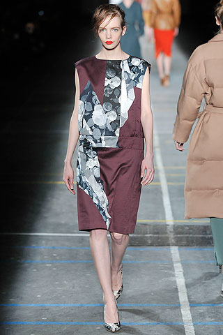
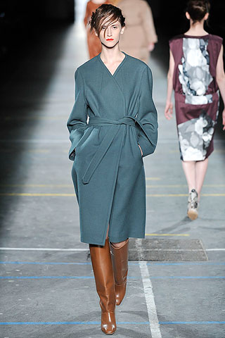
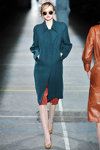
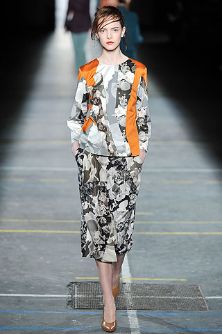
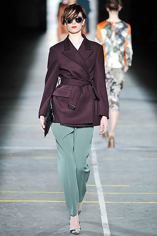
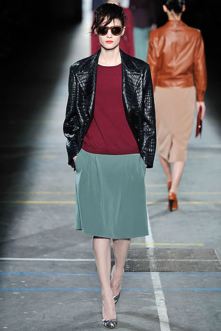
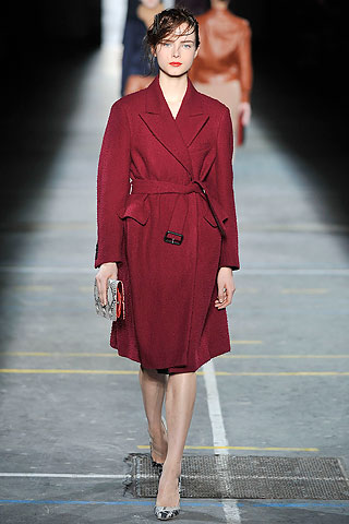
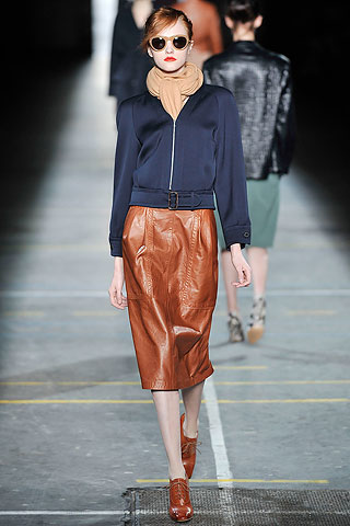
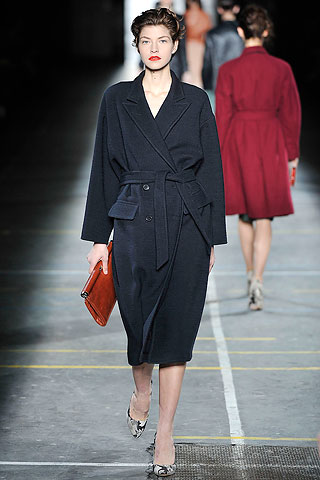
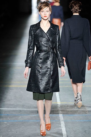
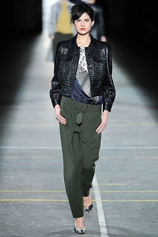
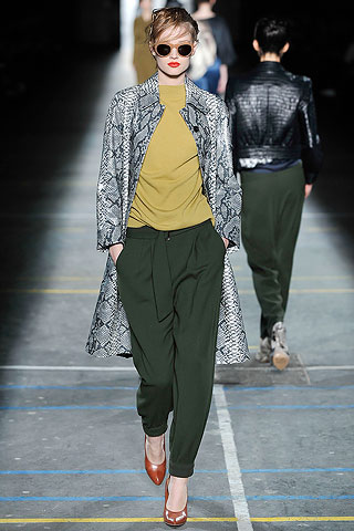
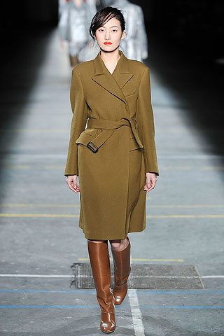
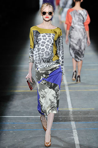
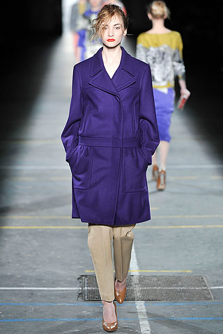
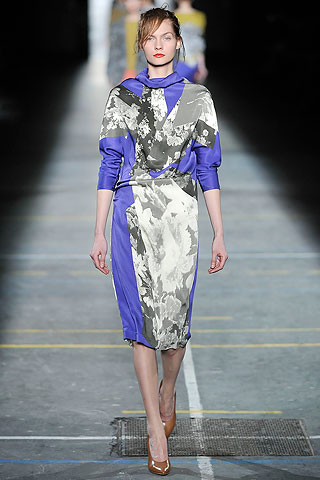
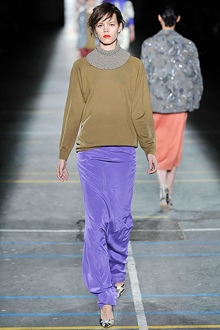
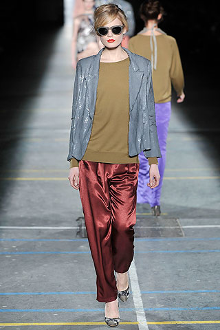
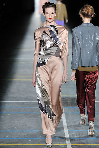
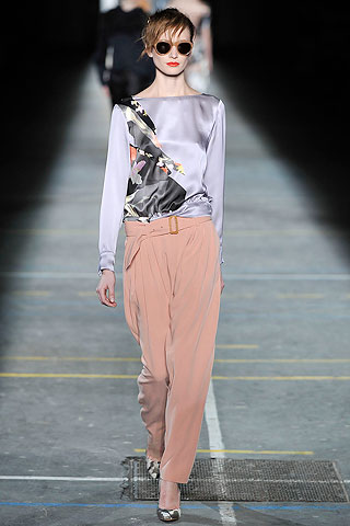
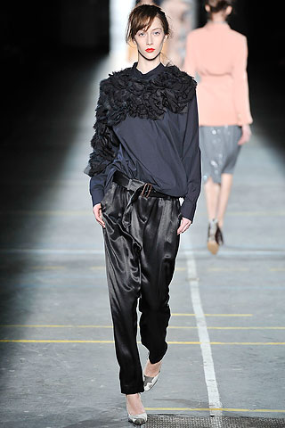
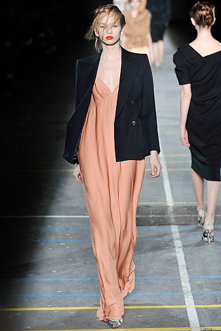
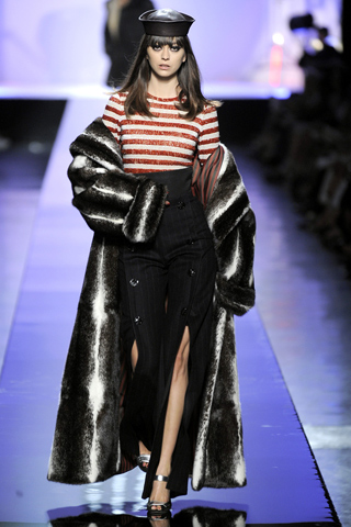
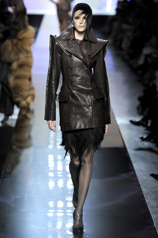
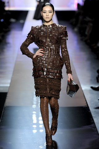
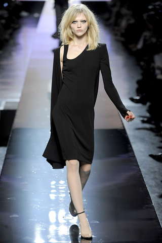
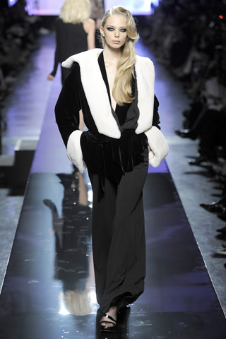
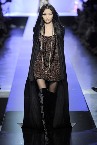
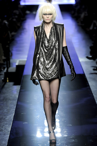
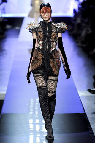
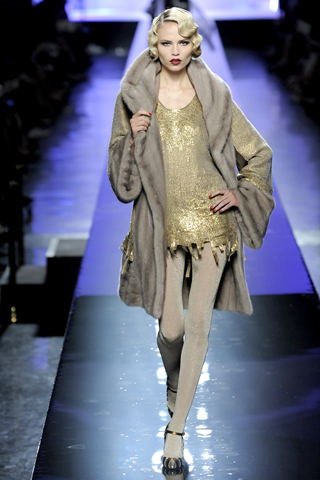
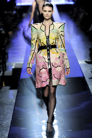
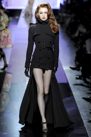
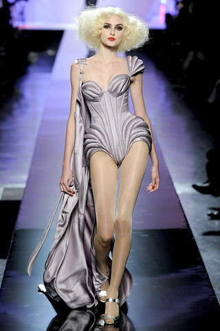
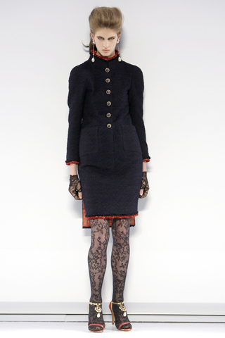
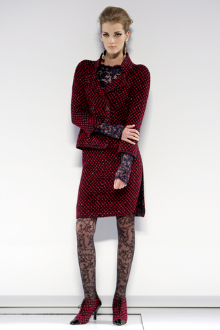
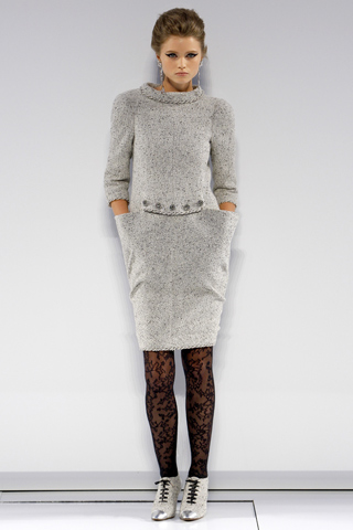
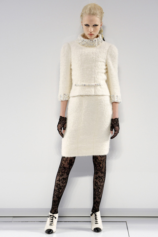
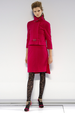
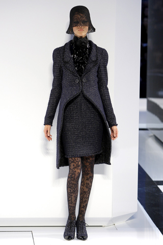
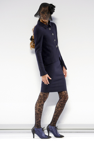
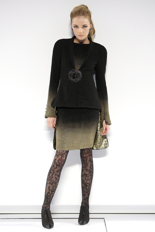
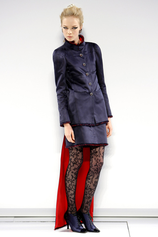
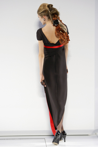
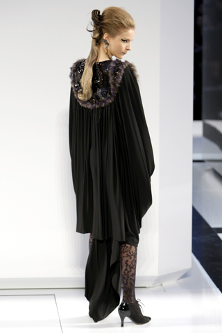
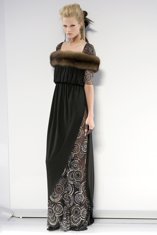
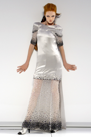
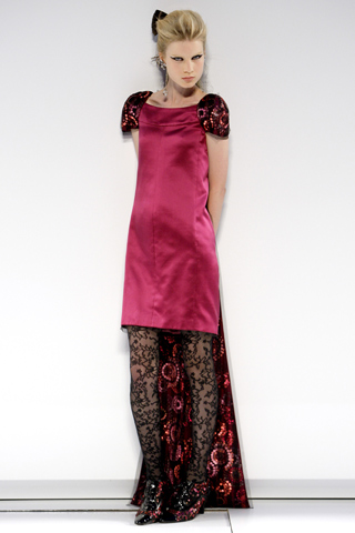
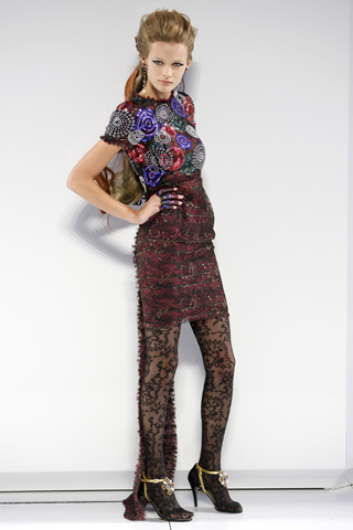
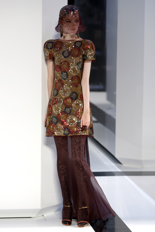
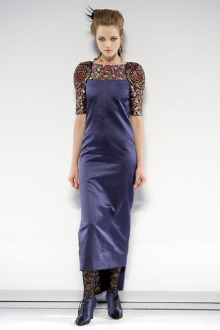
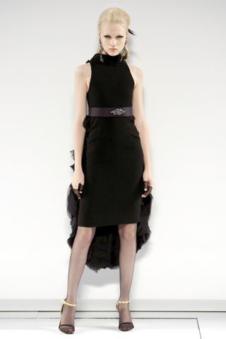
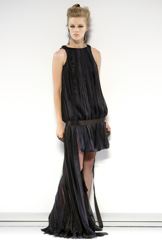
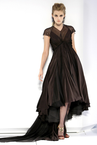
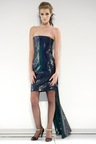
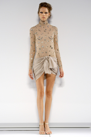
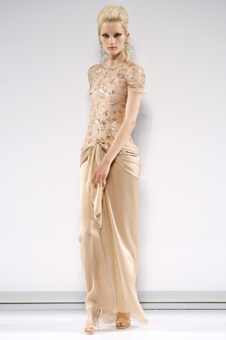
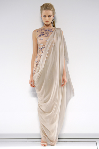
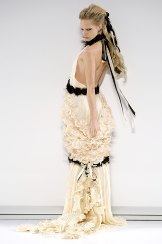
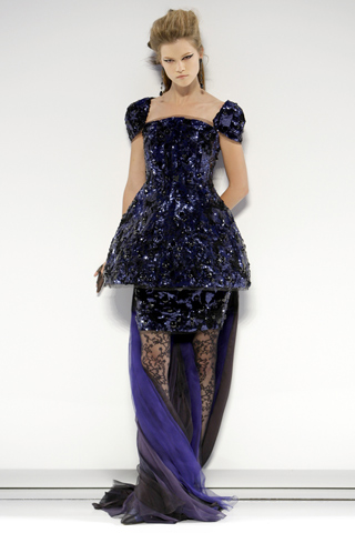
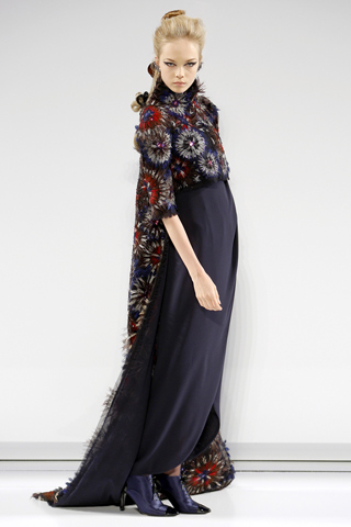
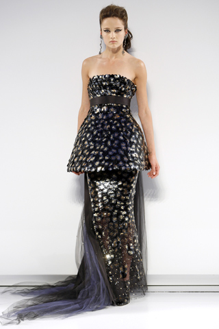
In addition to designer contributions, the report features commentary from fashion insiders and leading retailers discussing the geographic locations currently influencing fashion and design. Industry gurus highlighted in the report include: Cate Adair, costume designer for “Desperate Housewives”; India Hicks, creative partner at Crabtree & Evelyn; Simone Legno, chief creative officer at Tokidoki; Lanie List, chief merchandising officer at Iconix Brand Group, Inc.; Collier Strong, celebrity make-up artist; and Essie Weingarten, founder of Essie Cosmetics, Ltd. Contributors from Saks Fifth Avenue, Neiman Marcus and Macy’s also weigh in.Citing exotic destinations like Africa, India, Peru and Turkey as inspiration for spring 2011, designers continue to satisfy consumers’ need to escape everyday challenges with intriguing color combinations that transport them to foreign lands.  Flirtatious Honeysuckle is a feel-good hue that brings a festive sense of playfulness to this season’s palette. This vibrant pinkish-red for both apparel and cosmetics makes consumers feel alive, and is a perfect post-winter pick-me-up. Spicy, gregarious and persuasive describe Coral Rose, a sophisticated orange that, much like Beeswax, a warm, honeyed yellow, conjures up feelings of faraway lands and locales. Pair either of these piquant hues with a cool, refreshing color-wheel opposite like Regatta for a vibrant color combination that will add zest to any wardrobe. Romantic, fanciful Lavender implies sensuality with its subtle hint of red undertone. Combine it with Beeswax or Coral Rose for a unique counterpoint. Alluring Blue Curacao evokes thoughts of tropical destinations and pays homage to the 2010 Color of the Year, Turquoise. Practical consumers can continue to incorporate enticing Caribbean blues into spring by pairing Blue Curacao with warm, complementary colors like Honeysuckle or Coral Rose. Peapod, a fresh yellow-green, brings an organic element to the palette and is reminiscent of the green shoots that signify change and new beginnings traditionally found in spring. Trans-seasonal neutrals ground this season’s palette and provide a stable backdrop for all of the other colors. The so-called “nude hues” are represented in the range of ethereal Silver Peony to dramatically deep Russet. Another dependable background color, Silver Cloud, is the quintessential neutral that consumers can rely on to coordinate with everything in their closet.

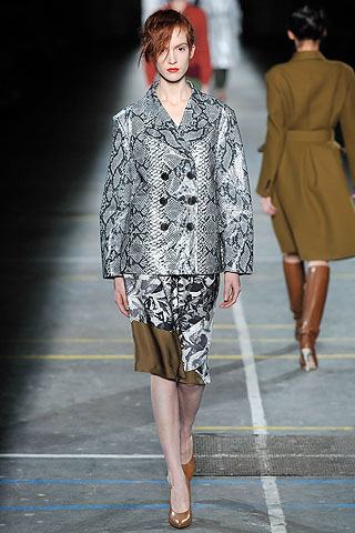
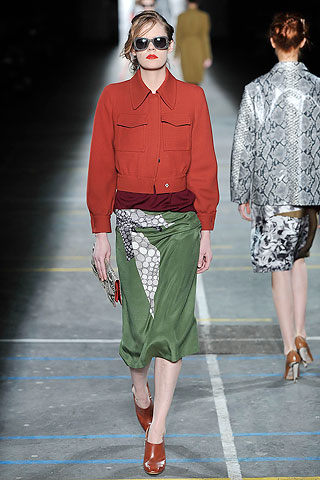
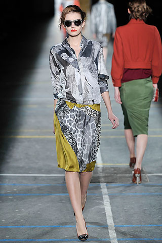
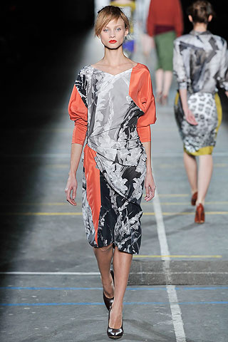
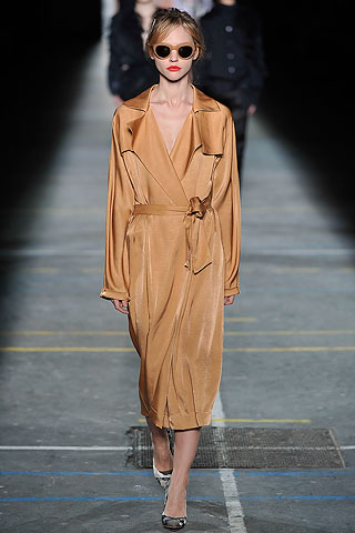
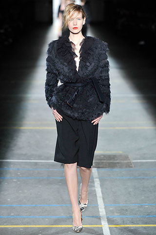
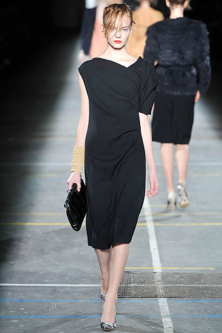
The top 10 Spring 2011 colors for women are:

Honeysuckle CMYK 4-75-24-0 GOE 26-2-4 PLUS 205

Russet

CMYK 44-67-76-9 GOE 21-4-3 PLUS 876

Coral Rose CMYK 0-63-86-0 GOE 19-1-4 PLUS 1645
Regatta CMYK 73-28-0-0 GOE 83-1-3 PLUS 660
Peapod CMYK 56-0-51-0 GOE 124-1-2 PLUS 7723
Blue Curacao CMYK 63-0-22-0 GOE 98-1-3 PLUS 3115
Beeswax CMYK 0-30-78-0 GOE 9-1-3 PLUS 157
Lavender CMYK 33-32-0-0 GOE 56-1-2 PLUS 522
Silver Peony CMYK 3-13-15-0 GOE 13-4-1 PLUS 7604
Silver Cloud CMYK 25-19-23-0 GOE 158-1-1 PLUS warm gray 3


Info FashionTrendsetter

Share
Sep 152009
 
 With Mercedes-Benz Fashion Week nowunderway in New York and designers unveiling their Spring 2010 apparel collections, the experts at color authority Pantone have weighed in and compiled the top 10 colors for spring women’s fashions.Spring 2010, according to the Pantone Fashion Color Report, calls for vibrant brights and practical neutrals, a diverse palette offering both exciting as well as familiar options for cautious consumers.”Now, more than ever, women are vigilant when it comes to spending,” Pantone Color Institute Executive Director Leatrice Eiseman said in the report. “Instead of reinventing their wardrobe at the start of each season, consumers want pieces to complement what they already own. Pairing a bold color with a basic piece or freshening up their look with bright accents addresses the need for practicality, as well as fun.”That thought extends to accessories, according to the report, with the season’s neutral basics set to be enhanced by brightly colored jewelry, as well as handbags and shoes.After surveying the designers of New York Fashion Week for prominent collection colors, color inspirations and color philosophies, Pantone has deemed the Spring 2010 colors as: turquoise, tomato puree, fusion coral, violet, Tuscany, aurora,  mparo blue, pink champagne, dried herb and eucalyptus.

Taking a closer look at the tones, falling on the more vibrant side of the spectrum is turquoise, a cool, tropical hue; bright Amparo blue, a navy-esque tone with warmth; romantic violet; greenish-yellow aurora; bold and provocative fusion coral; and tangy tomato puree, the season’s classic red.

Among the neutrals forming the season’s color backbone is the delicate, wispy pink champagne; Tuscany, a warm beige; dried herb, the ultimate green neutral, which will pair well with all other colors; and cool eucalyptus, a classic, practical gray.

PANTONE®
Fashion Color Report Spring 2010

Pdf File – 2.58 MB


The top 10 Spring 2010 colors for women are:


Turquoise
PANTONE 15-5519
C/M/Y/K 61 / 0 / 32 / 0
GOE 104-2-3C


Tomato Purée
PANTONE 18-1661
C/M/Y/K 13 / 99 / 70 / 0
GOE 26-3-1C


Fusion Coral
PANTONE 16-1543
C/M/Y/K 1 / 48 / 42 / 0
GOE 16-1-2C


Violet
PANTONE 16-3320
C/M/Y/K 25 / 53 / 0 / 0
GOE 45-1-3C


Tuscany
PANTONE 16-1219
C/M/Y/K 25 / 35 / 41 / 0
GOE 16-4-1C


Aurora
PANTONE 12-0642
C/M/Y/K 4 / 5 / 72 / 0
GOE 2-1-3C


Amparo Blue
PANTONE 18-3945
C/M/Y/K 81 / 47 / 0 / 0
GOE 69-1-6C


Pink Champagne
PANTONE 12-1107
C/M/Y/K 1 / 10 / 20 / 0
GOE 147-1-1C


Dried Herb
PANTONE 17-0627
C/M/Y/K 45 / 31 / 65 / 10
GOE 153-1-3C
Eucalyptus
PANTONE 15-0513
C/M/Y/K 26 / 22 / 40 / 0
GOE 153-1-1C
 
 
Share

Dries Van Noten Fall-Winter Ready-to-Wear 2009

 Fashion Trends  Comments Off on Dries Van Noten Fall-Winter Ready-to-Wear 2009
Jul 282009
 
 Many designers seem to be running into difficulty over how to approach women this Fall, dividing their collections schizophrenically between sober-sided sellers and artistic gestures of the sort they hope magazine editors will put on their pages. Dries Van Noten has no such conflicts: He doesn’t have to cast about for a “realistic” attitude because that, and never made-for-editorial fireworks, is what his business is based on.

It’s given him the authority to respond to the times with a relaxed elegance that many women will identify with. It boils down to simple suggestions: an easy-fitting blazer to slip over a blouse and fluid pants; a draped day dress; a sweater to wear over a long skirt for evening. The show opened and closed with belted camel coats (an item that might turn out to be the sartorial symbol of this recession’s sudden shift in aesthetics), but the strange color combinations in between threw off any feeling of dullness. Van Noten had taken the shades of Francis Bacon’s paintings—shrimp pink, beige, ocher, orange, and mauve—and deployed them in a way that gave life to pieces that might have seemed boring in other hands.

While there was nothing overtly retro in it, the undercurrent was of the day-to-day glamour women in Europe and America mustered for themselves while facing the privations of World War II. It was there in the horn-rimmed sunglasses and the Eisenhower jackets, and the template of making the best of oneself in “good” simple clothes, with a slash of orange-red lipstick to keep up morale. All that was subtly reinforced by the long, streetlike runway, which was reflected in a two-story-high mirror that gave an angled overhead view, as if from an office-block window: an impression of a legion of city women pressing on with their lives, come what may.


Share

Jean Paul Gaultier Couture Fall-Winter 2009 – Paris Fashion Week

 Fashion Trends  Comments Off on Jean Paul Gaultier Couture Fall-Winter 2009 – Paris Fashion Week
Jul 282009


There was no misunderstanding the opening, at least: the MGM signature tune and Lara Stone strutting petulantly in a leather trenchcoat, beehive, and giant pout—it was Bardot to a T! Jean Paul Gaultier always lets us know where we are at the outset, and for Fall, we were off on a movie buff’s coach tour of the gracious wardrobes of Hollywood heroines. Ostensibly. In fact, it proved a bit of an elastic theme that at times meandered off-script. It ranged so widely—from a Louise Brooks flapper dress and gilded fur coat to an ultrashort gold T-shirt under a black leather vest that looked like a possible choice for Lindsay Lohan—that it was sometimes hard to see where the designer was going. (Geometric-Deco meets sci-fi was a particularly odd patch.) Still, theme fashion shows are a dusty old concept in the first place. All that matters in haute couture is a strong voice, incredible workmanship, and whether a balance between timelessness and timeliness has been struck. Gaultier did all that by working in his stock characters and garments: the matelot, the androgynous lady in the pantsuit, the trenches, the smokings, the corsets. No one in Paris can top his tuxedo coat with velvet revers, the just-so cut of a pantsuit with a double collar, or the funny showgirl things he did here as an excuse to spotlight the kind of corseting he’s been doing since before Madonna was a star. As for the timeliness, he threw in a nod to sporty-casual chic (a notion that’s raising its head with persistence this week) via overalls in both amethyst velvet and gold paillettes. Goodness knows where they came from, but they seemed kind of right.


Share

Chanel Haute Couture Fall-Winter 2009

 Fashion Trends  Comments Off on Chanel Haute Couture Fall-Winter 2009
Jul 262009


Before rating Chanel’s Fall couture, let’s consider what Karl Lagerfeld has already done for the house in the last six months. There was the indelible, incredible high of his all-white couture show in January. Then, a matter of weeks ago, the staging of an unforgettably glamorous Resort collection on the beach at the Venice Lido. All this supremely heart-lifting fashion, delivered in a year that is technically the most depressing in living memory.

Back in Paris again, was it going to be humanly possible to top that for a third time? As it turned out, not quite. The Chanel couture for Fall, shown in the Grand Palais on a stage set with giant white N° 5 bottles, had a comparatively toned-down atmosphere. Lagerfeld’s single conceit was a play on graphic proportion—suits and dresses with a longer flyaway panel in the back, all shown with lace tights and stiletto-heeled booties. As the show progressed, he offered up some remarkable looks: a “smoking” redingote with a ruffle-necked blouse; a crinolined dance dress; pretty, light chiffon dresses in nude or midnight blue with ruffled trains. The outstanding look, though, was the one where the panel device was the least evident: a superchic spiral-cut dark blue dress with an asymmetric “tail” lined in red. All the Chanel craftsmanship was there, of course, and impeccably achieved. For all that, Lagerfeld didn’t manage to outstrip the genius of those previous two shows. That’s the annoying thing when you’re competing against yourself.


Share